But the donation page is only part (the final part) of the non-profit website puzzle. Before your visitors can donate, you have to get them there, and make sure they’re in a giving mood when they arrive.
Not an easy task!
Don’t worry.
Together we’ll get your website working like a tear-jerking fundraising machine that snatches your donors up and doesn’t let them go till they scream ‘take my money!’
Maybe that’s a bit too far…
But seriously, if you want to make your website more effective, you’ve come to the right place.
Many people will find your site. But who do you want to find it? Who did you put the site up for?
Who is your website for?
You can’t please (or appeal to) everyone at the same time.
An important rule in marketing is talk to your prospect, and ignore everyone else. If they stumble on your site and like it – great. But you’re interested primarily in one person. That’s who you’re talking to. That’s who you develop your copy to appeal to.
I’m going to assume that the people you most want to talk to are your donors.
The copy you write for them will have a different focus than if you were writing for your employees or the media.
This is like when you write direct mail letters. A letter to your long-time donors is going to be worded very differently from an acquisition letter.
If you were designing your website to speak to your donors, you’d focus on giving them the information they care most about.
Your mission statement? Long-time donors don’t care. Newcomers don’t particularly care either.
What they want to know is:
- What good are you doing?
- How are you doing it?
- Most importantly, how good is it going to make me feel if I send you money?
What do your donors want?
You hopefully know the answer to this question better than I. But just in case, let me give you some suggestions.
Those stories that work so well in your appeal letters? They’ll work well on your website too.
All the donor-love you put into every communication you send out? On your website, space isn’t an issue. You’re free to shower your donors with love wherever you can!
For the more rational-minded, sidebars are great places to stick alarming (or encouraging) statistics.
What do your donors want?
Donors want the feeling they get when they give to a good cause. They want the satisfaction that comes from donating to right a wrong, feed a family, or save a life.
They want to feel good through their generosity.
It’s your job (and your website’s job) to show them how to do it.
Your website – every page – must make your visitors feel. It has to hit them in their hearts. Choke them up. Satisfy their need to make the world a better place.
Don’t just tell them about the problems you solve. Show them. On every page.
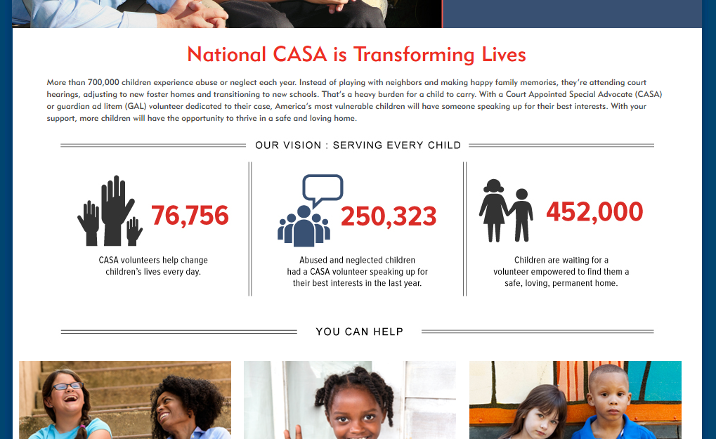
Here’s an example from the home page for Court Appointed Special Advocates’ (CASA) national site:
“Instead of playing with neighbors and making happy family memories, they’re attending court hearings, adjusting to new foster homes and transitioning to new schools. That’s a heavy burden for a child to carry.”
With those first few sentences, you know who CASA helps, and you know why their help matters:
Abused and neglected children stuck in foster care - robbed of their childhoods.
Now look at the bottom of the screen grab.
“You can help”
What follows those 3 simple (yet critical) words are different ways for people to get involved – either through volunteering as a CASA or donating money.
See that little girl smiling and waving in the middle? She links to a collection of stories of children who have been helped by the CASA program.
Some of those stories aren’t for the faint of heart. They tell of the terrible abuse and neglect the kids suffered – and how in the end, their lives were changed because of their CASA.
The entire site is designed with the potential donor (or volunteer - CASA is a volunteer dependent organization) in mind.
Now compare the national CASA homepage with your own org’s home page. (Or pretty much any other non-profit for that matter. Lots of less-than-compelling websites out there…)
Does your home page present the need effectively? Does it claw at your visitor’s feelings? Does it provide an obvious way to act on those feelings?
If so, good for you! You’re doing great!
If not, perhaps it’s time to do some editing – this time with your donors in mind.
But ok. That’s the home page. What about other pages?
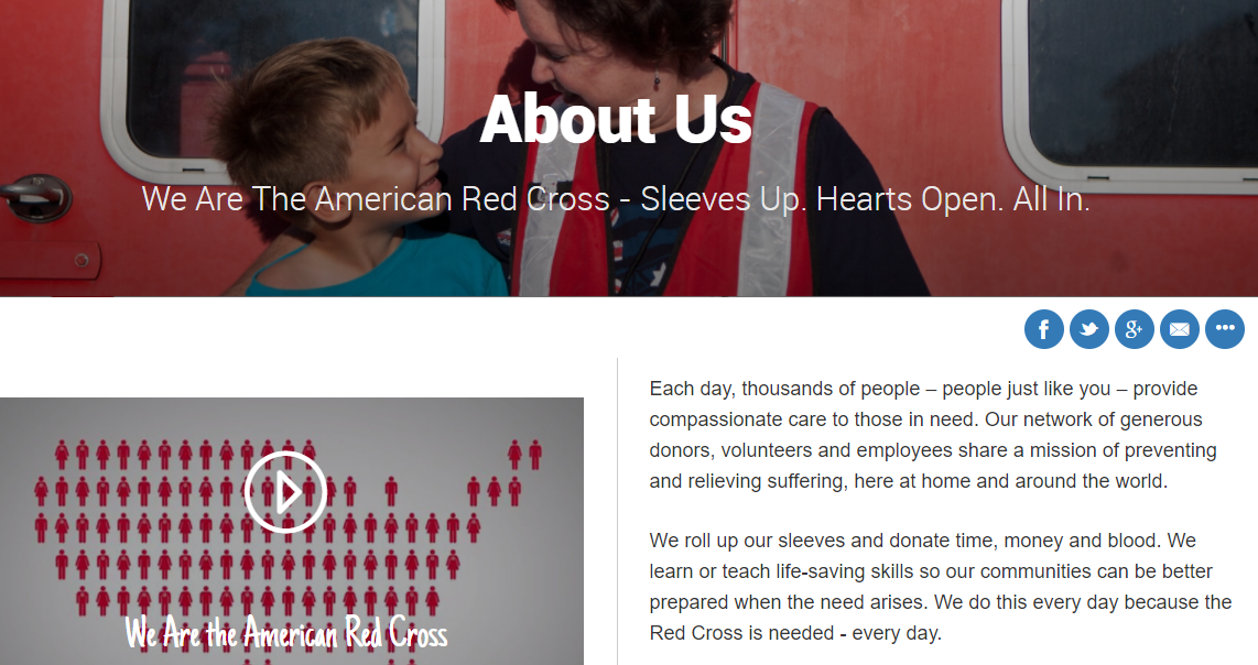
Here’s a screen grab of the ‘about us’ page from the American Red Cross.
Yet it doesn’t talk about the American Red Cross!
It talks about their volunteers and supporters – “People just like you.” Everything is framed with the volunteer and/or donor in mind.
Their ‘about us’ page does eventually tell you about the Red Cross, and if you scroll further down you’ll find
descriptions linking to other pages devoted to their many service areas.
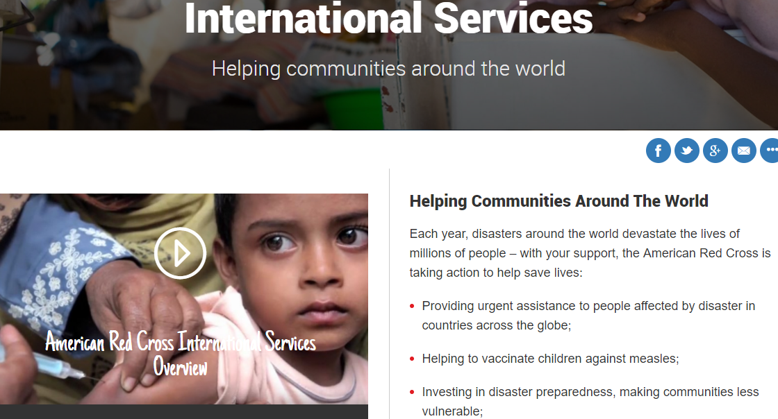
But click one of those links – in this case ‘international services’- and it takes you to:
It starts with presenting the need: “Each year disasters around the world devastate the lives of millions of people.”
That line could appear on any organization dedicated to international disaster relief.
The focus is not on the American Red Cross, but rather on the need they serve.
Notice that only once the reader is mentioned (“with your support”) does the copy shift to talking about the American Red Cross and the services they provide.
Their entire website is written to appeal to their donors and volunteers.
Yours should be too.
Successful online fundraising is a process. All the pieces should work together to keep your donor in the right state of mind.
The first place you should start – you can do this right now – is figuring out who your donors are, and how they like to be talked to.
Focus your website on your donors, and when they see the ‘donate now’ button, they’re more likely to click it.


 RSS Feed
